Zikit publishing
Responsive e-commerce website
An exclusive and elegant shop dedicated to the independent publisher that operated in Israel between 2012-2015. A project inspired by the love of the written word that is the cornerstone of the publisher.
Individual project | UI design | UX by create

”
As book lovers, we have a passion for sharing
inner worlds and sharing what the book has done for us
Key features
Zikit is a unique publisher that requires a unique website. The boutique independent publisher sets its high quality standard using three concepts which I identified as the leading ideas of the project’s visual language.
Literature
The passion for literature was the first and foremost element in the design. The publisher seeks out hidden literary gems from all over the world and translates from various languages to elevate their passion for the written word.
Colors
The publisher holds a clear visual language across different publications. Each cover is characterized by a single, clear color and standardized dimensions. These help the shopper identify the book and the publisher at a glance, and the visual language became synonymous with the publisher's high-quality mark.
Illustrations
Another important element of the publisher’s visual language is the unique cover illustrations assigned to the books. The woodcut print technique invokes a classical and traditional image of the early days of print and bookmaking, and each print refers directly to the book and is inspired by the author and story.


The old website
The old website is a product of its time. For today’s eyes, it is overcrowded with color and information, and it is hard to navigate and understand at a glance. Additionally, I felt that the overall tone is too general and doesn’t do enough to emphasize the uniqueness of the publisher’s well-established visual language.


The website: Home page
In my design approach, I wanted to achieve a clean look that invokes the experience of walking through the shelves of a boutique bookstore, allowing an approachable tour of the atmosphere.

Elements
I worked toward incorporation of the three key features of the publisher: a design that builds upon the color-code of the book covers, borrowing from the beautiful hand-printed illustrations, and above all - a design that invites the viewer to celebrate the written word.
Literature
The first element visible in the home page is a quote from the Zikit’s first publication: Parnassus on Wheels, a book about a passion for books. A quote about the love of books and the simplicity of books that sets the tone for navigating through the collection. The message is clear: the viewer is welcomed to a world of books. Similarly, the prominent font chosen for headings and quotes throughout the site is a serif font, invoking another association to printed books.

Illustration
For each book published, Zikit commissioned a unique hand printed illustration by illustrator Neta Hemo. To enhance its effect, I expanded upon the existing illustrations with my contribution, drawing from the history of the arts. The intention is to show another glimpse of the product and help draw in the costumer. The experience I sought to invoke was browsing through the shelves and gaining hints toward a secret world.

Product page
The inspiration behind the product page design is the act of skimming through a book next to the shelf, appreciating the language and the feelings it invokes. Every product page is an attempt to capture the unique feel of each book and uses the book’s assigned color scheme and the visual style of the illustration.

Elements
The first element visible is a strong injection of color - the book’s unique color. In this instance, the page uses the bright pink of the Parnassus on Wheels printing.
Next, the attention is drawn to a large image of the book’s cover, along with the original illustration by Neta Hemo. Around the cover is my expansion upon the illustration.

The viewer is granted a teaser reading of the first chapter, allowing him to ‘skim’ the book before purchasing.
A written review is an important element for the book lover. Costumers have preferred critiques and platforms, and the design allows for a fast and approachable read of the main tagline of the critique alongside the author and platform.

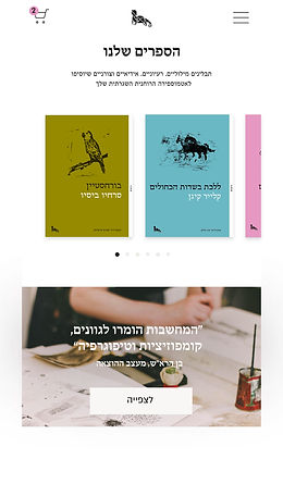
Mobile home page
Today’s market requires a responsive, intuitive phone adaptation, compatible with various display options and operating systems. The design works toward bringing the bookshelf experience to a handheld device.
The front page keeps the welcoming quote to invite the viewer into a clean world of a passion for the written word.

Product preview
The next screens of the homepage offer a preview of two products. The viewer is invited, using the established visual language of the publisher, to further learn about the book and purchase it. The main elements of the screen are the cover, a short text, and an inviting ‘purchase’ button.


Swipe library, A Video and a Contact form
The next screens of the homepage offer an even broader review of more products. A visual library that the viewer can swipe through to gain access to specific product pages, leaning on the established visual language's ability to draw in the reader, especially on a white background.
Next, the viewer is welcomed to view a video telling the story of the publisher and the process of printing and illustrating the books. The quote, by the publisher’s designer, highlights the principles behind the design.
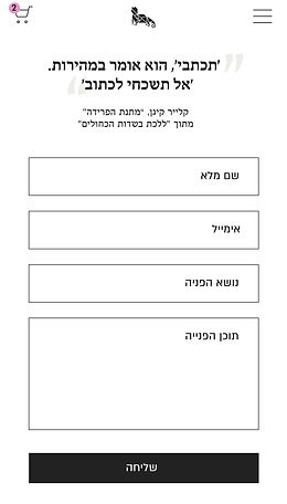
A clear and approachable form allows the viewer to efficiently contact the publisher. An accompanying quote further invokes the importance of the written word.
Product page
The move to a handheld device requires an efficient design, including only the most crucial elements. Regarding the product page, this includes the book’s cover and unique visual signature, alongside a clear price tag and an option to purchase.

Critical reviews & Costumers’ ratings
Keeping the important elements from the desktop version, the handheld product page includes critical reviews together with costumers’ ratings. A very simple visual representation of an average rating and individual ratings, and an invitation to add a review.

